Resolution’s logo is pretty clever. See the people/jigsaw idea? I like that. But their other design materials did not really represent the logo’s style very well – until recently.
 Their online design was already looking good. They have a great website by those nice people at Electric Putty. As an association of divorce lawyers, they needed their printed work to look just as good.

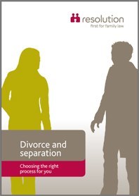
So they asked me to redesign their marketing leaflets, which I did by taking the stylised silhouette idea from the logo and translating it into a series of images of people interacting, which is what their work is all about. As you can imagine, the interactions their clients are involved in are often pretty stressful. I wanted to show this in a way that people could relate to, without it looking too grim. Using silhouettes kept a personal element in the design which suited their target audience and looked clean and easy to read.
When that went well, I carried on with some of their other material, to date a publications rebrand with practical guidelines and templates for their staff and suppliers to use.
